Making a pie chart in Google Sheets is a straightforward process that involves a few simple steps. Here’s a comprehensive guide to help you create and customize a pie chart in Google Sheets.
Step-by-Step Guide
1. Open Google Sheets
Start by opening Google Sheets in your browser and either create a new spreadsheet or open an existing one where you want to create the pie chart.
2. Enter and Select Your Data
Enter your data into the spreadsheet. The first column should contain the labels or categories, and the second column should contain the corresponding numeric data. Select the data range you want to visualize, including the labels and values.
3. Insert the Chart
Click on the “”Insert”” menu at the top of the screen and then select “”Chart”” from the dropdown menu.
4. Choose Pie Chart Type
In the Chart Editor that appears on the right side of the screen, go to the “”Setup”” tab. Under “”Chart type,”” select “”Pie chart”” from the dropdown menu. Google Sheets will automatically create a pie chart based on your selected data.
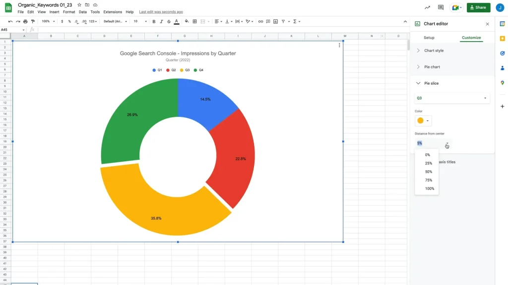
5. Customize Your Pie Chart
To customize your pie chart, switch to the “”Customize”” tab in the Chart Editor. Here, you can change the chart style, alter slice colors, add or delete chart titles, and adjust the legend position. For example, you can double-click the chart title to edit it or go to ‘Chart & axis titles’ to format the title text.
6. Additional Customizations
You can add a slice label, a doughnut hole, or change the border color of the pie chart. Click on a pie slice to see a small box with the item’s name, value, and percentage.
7. Move the Chart
If you want to move the chart to a separate worksheet, click on the chart to highlight it. Then, use the dropdown menu in the top left corner of the chart and select “”Move to own sheet””.
8. Finalizing the Chart
Once you are satisfied with your customizations, your pie chart is ready to be used. You can share it, embed it in a website, or download it as an image.
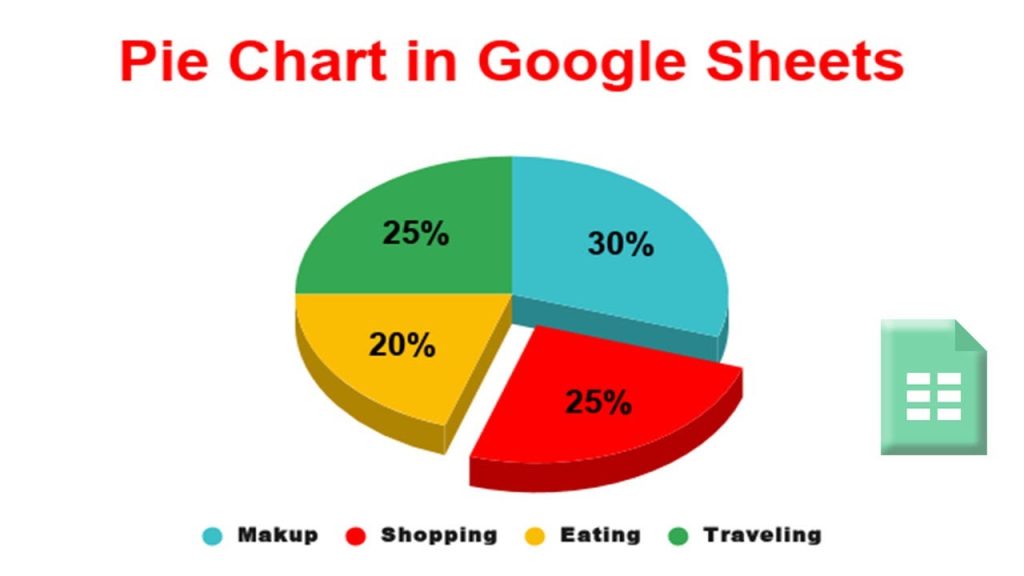
Example Image
Here is an example of what your Google Sheets interface might look like when creating a pie chart:
Tips for Effective Pie Charts
- Use Pie Charts for Simple Comparisons: Pie charts are best used when you want to compare parts of a single data series to the whole.
- Limit the Number of Slices: Too many slices can make the chart hard to read. Aim for a maximum of 5-7 slices.
- Ensure Data Accuracy: Make sure your data is accurate and that the total adds up to 100%.
By following these steps, you can create a visually appealing and informative pie chart in Google Sheets that effectively communicates your data.
Final Thoughts
Creating a pie chart in Google Sheets is a simple process that can enhance your data presentation. By carefully entering your data, choosing the right chart type, and customizing it to your preferences, you can create a pie chart that is both informative and visually appealing. Try making a pie chart in Google Sheets today to see how it can help you visualize your data effectively.